Introduction:
For those of you familiar with my work on Log Analytics, you know that I have at several times throughout several articles touted the ability for PowerShell to pull Windows Events, including those from the Security log which the now old Log Analytics agent could not do. And, unfortunately, the new AMA has other faults which prevent me from saying that it satisfies that need.
This is an ability I have already shown off in the System Usage & Authentication Monitoring collector and with this series, that ability will expand. This collector pulls Windows events regarding executables being launched or terminated. Much like the System Usage & Authentication Monitoring, this has a primary focus on showing how an employee is using their machine, at least in terms of applications, with a secondary security benefit of being able to search and look for problematic programs or things like click-to-run EXE’s that don’t show as an installed application on machines.
To give a bit of a teaser – one of the greatest strengths this collector has is its ability to show you how recently certain applications have actually been used. For instance, you may eventually find yourself licensing 5,000 instances of Visio. The question is, do all 5,000 of those people really need a Visio license, or have some of them not used it in over X days and can thus be revoked? This is a huge cost savings question as all too often app licenses seem to be dished out for simple one-time needs.
Note: For avid readers, this article and series will be very similar to the System Usage & Authentication Monitoring articles as the overall methodology is very similar given both are simply collecting Windows Events. That prior series will be referred to somewhat frequently within this article but no knowledge of it is required.
In this section, we will cover…
- Prior Knowledge Requirement
- Credit where Credit is Due
- The Nitty Gritty
- What does this tool provide? (Further breakdown in this section)
- Conclusion
- The Next Steps
Prior Knowledge Requirement:
For those familiar already with my Windows 365 series, Endpoint Monitoring series, or again the System Usage & Authentication Monitoring series, this section is going to be exactly the same.
Once again, this series of guides will build on the information provided in my Log Analytics learning series V2. While that series used a generic and basic collection script for the sake of learning how this all works, this series will provide you with a fully-fledged collection script and workbook to go along with it.
Many of the concepts, ideas, terminology, and components carry over entirely from the learning series. For this reason, I will not be covering those items in depth as part of this series. Instead, I will expect readers to already have that knowledge, and/or I will link back to the learning series as needed. Linking back will be primarily for the shared setup components, expect those links to be mainly in the future articles in this series.
While you don’t need in-depth knowledge of how this works under the hood to understand this initial article and the powerful data this tool provides, I would highly recommend entirely following the learning series before attempting to deploy this. That way you will have 80% of the required items set up already and, you will better understand what is actually happening and the costs behind what is being done, rather than just clicking the buttons I say to.
Credit where Credit is Due:
It’s worth adding that the original “Device Inventory” collector which was part of the Intune Enhanced Inventory by Jan Ketil Skanke of the MSEndpointMgr team is what gave me the guidance and inspiration for this collector way back when I originally started playing with the concept of collecting Windows events in Summer of 2022. That said, honestly speaking, there is very little left of the original thing outside of the general concept of how arrays are built to upload information. This collector has been converted to the DCR-based Logs Ingestion API, utilizes the upgraded Function App for that API, is updated to the latest HTTP(s) Function App Auth I am a contributor to, and I developed the time tracking methodology and event searching/filtering methodology that made collecting Windows events possible.
The Nitty Gritty:
Those familiar with the System Usage & Authentication Monitoring series may recall this section highlighting the various asterisks, footnotes, limitations, and caveats to that solution.
While this tool doesn’t have nearly that level of complex intricacies to be aware of, especially given we are simply after two events instead of the dozen the System usage collector goes after, one important statement does still stand. That being, while this is certainly a good tool to have, you need to understand that it does not replace or suffice on its own as a real-time security executable tracking solution. That is why it is primarily about application usage, and secondarily about application monitoring/tracking.
While there aren’t as many intricate details to review with this solution, the few details are still quite technical and require a deeper understanding of how this works under the hood. Because of that, they really don’t belong in an overview article. As such, the second part of this series will cover those topics as well as talk about just how on earth this thing works.
What Data does this tool Collect?
Let’s get right into it. What does this achieve?
NOTE: All of the following screenshots and information are previews which are subject to change!
In short, Intune has a lot of reporting shortcomings, and this tool aims to fill in those gaps. This Log Analytics collector will pull Windows events surrounding the launching and termination of executables on a machine. The goal of this is to understand the who, what, when, and where. Who launched it, what was launched, when was it launched, and where was it launched from (path to executable). This is done by first enabling and then collecting the following Windows events.
- Security Event ID 4688 – A new process has been created
- Security Event ID 4689 – A process has exited
We will then use Log Analytics workbooks to compile the data in a human-friendly manner for both viewing and exporting. If you want, you can take it to the next level and forward that data to other solutions (including 3rd party) via an Azure Event Hub.
Below is a summary of how the data is then primarily displayed. We will do a deeper look at each of these.
Dashboard:
- Summary of Creations and Terminations by 30 Minute Intervals
- Summary of Events by Computer Name & 30 Minute intervals
- Top 10 Most Creations by Program
- Top 10 Most Terminations by Program
- Top 10 Most Creations by User
- Top 10 Most Terminations by User
Queries:
- Application Most Recent Usage
- Chart: Application Most Recent Usage
- All Application Usage
- Chart: All Application Usage
- Device-Specific Results
- Chart: Device-Specific Results by Top 10 Apps
- User ID Specific Results
- Chart: User ID Specific Results by Top 10 Apps
Ingestion Information:
- Count of Devices Sending Data
- Script Version by Data Point Count
- Chart of Incoming Events by Log Version: 1H
- Chart of Events Coming in by Computer
- Chart of Events Coming in by Computer: Distinct
Dashboard:
This is what you will see right on the front page of the workbook. This page is primarily focused on providing a general overview of the data coming in for identifying outliers and/or unusual activity.
Like always, the time range for ALL data used in all queries of all pages is controlled by a time selector at the very top of the workbook.
Summary of Creations and Terminations by 30 Minutes:

This chart displays the total creations and terminations aggregated by 30-minute time spans over your selected time range. Again, its main purpose is to help visualize the data coming in and help be on the lookout for any anomalies. Here we can see a very steady pattern through the work week with a drop over the weekends. Interestingly, there is a Termination peak visible around the 30th that just barely edges out of the top of the Creation peak.
Summary of Events by Computer Name & 30 Minute intervals:

This chart displays the total events (creations and terminations) by Computer Name aggregated by 30-minute time spans over your selected time range. This lets us see what devices have had the highest creations plus terminations in a 30 minute span. Again, it’s main purpose is to help visualize the data coming in and help be on the lookout for any anomalies.
In the sample data here we can see that our top couple of worst offenders pull nearly double the total events as eighth place, let alone something like 20th place which only has around 2k events at most in a single 30 minute period.
Unfortunately, it’s difficult to provide an overall view of just the worst offenders without creating a “other” column (the dark blue line) which represents all other machines and thus simply blows all the other data out of the water as far as visualization. Specifically, it’s hard to do this when I’m grouping results over time like this as trying to sort out top offenders takes specific time points instead of overall. In other words, I get a single 30-minute span as opposed to a graph of all that devices data over time. I’m hoping to play with this more but for now it at least gives you an idea of top offenders in a 30 minute span.
Top 10 Most Creations by Program:
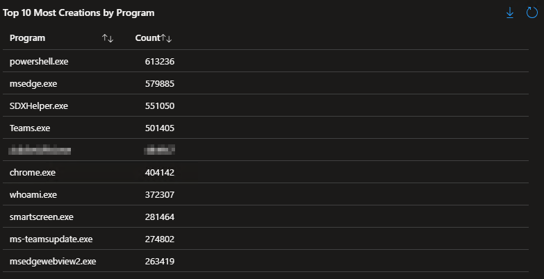
This query provides a simple list of the top 10 most executed executables over the selected time range. Once again, its goal is to help understand from a high level what is being seen. I’m very curious myself as to why Whoami.exe (a simple program to determine your own username) is executing so many times. Perhaps there is something automated or otherwise built-in that calls to it on a frequent basis.
Top 10 Most Terminations by Program:
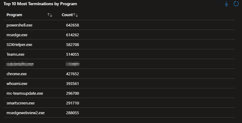
Going in the exact opposite direction of the above, this chart displays the 10 most terminated programs. Typically, this will heavily match to the above chart as that which starts eventually needs to end.
Top 10 Most Creations by Device:

Along the same vein of thought, this list shows the top 10 creations by the Device rather than the application. This allows us to see what units are calling an unusually high number of processes compared to the norm. Please understand, this is not grouped by 30 minute internals and thus instead of showing devices with a high 30 minute period, it shows devices total calls over the entire selected time range.
Top 10 Most Terminations by Device:
On the flip side, this shows us the top 10 terminations by Device to again look for outliers.
Top 10 Most Creations by User:

Continuing the same pattern, this list shows the top 10 creations by the launching user rather than the application. This allows us to quickly realize we have someone (or something) calling an unusually high number of processes compared to the norm.
Top 10 Most Terminations by User:
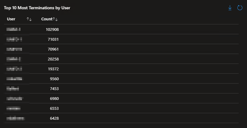
Again, flipping the above back around, that which starts must eventually end. However, we can see that these totals are much higher than the creations. That can be explained but it will have to wait for the Technical Details article which comes next.
Queries:
As usual, this workbook features a Queries page. Obviously, as a workbook, it’s full of queries. However, this page is meant for you to query something. This is where you can search for specifics by application name (executable name), device name, or the user ID who started or stopped the application.
As an important note, this runs off the executable name, not the “application” name. For instance, we know Microsoft Word as simply “Word”, but its executable is WinWord.exe. Sometimes an application’s executable name is intuitive, sometimes it is not. This limitation is simply a result of the Windows event not logging the application’s common name; thus we can’t collect it.
Application Most Recent Usage:
This query and its partner graph are very important, they are the highlight of what this tool can do for cost savings. This query produces a list of only the most recent executions of an application by unique combinations of the Computer Name, Program, Program Path, and User ID. In effect, this lets us see who is actually using an application but only when they most recently used it. To be clear, if Bob launches Acrobat 3 times over the week, this will only display his most recent launch of the app. However, if he then launched it on another machine, or launched Acrobat.exe under a different path, those would also show up as their own separate entries, at least in terms of the most recent entry per combination.
For instance, below we can see only the most recent executions of Visio.exe. This lets us see who is actually using their Visio license, and thus who actually needs it.

We can just as easily pull any other application. For instance, who is actually making use of their Acrobat license? Now you can answer that question, and more importantly, the question of who isn’t and thus can have their license revoked. Of course, this is best paired with a simple streamlined process for re-requesting a license, as well as the automated uninstall of the app now that they are unlicensed (and in this case, re-installing a free PDF reader and/or changing the defaults to a browser).
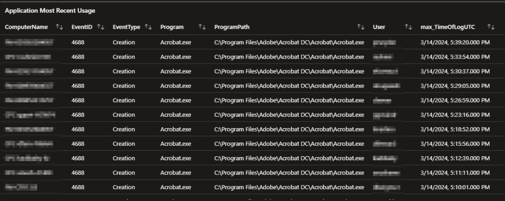
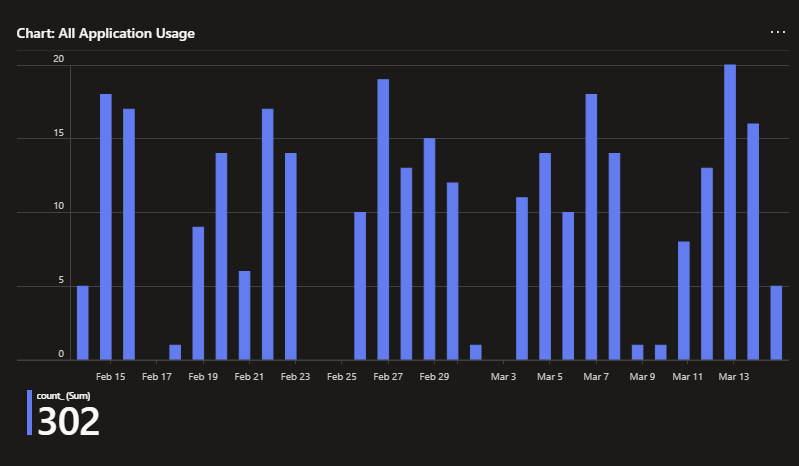
Chart: Application Most Recent Usage:
Lists are great and all, but sometimes you just need to see the data. Just like the above list, this chart only shows the most recent launch per unique combinations of the Computer Name, Program, Program Path, and User ID. In effect, this gives us an idea of how often an app is used by the audience that is using it.
For example, looking at the below we can see that the majority of Acrobat users use it frequently as many of them were most recently used today or just yesterday, with the quantity then rapidly trailing off as we go back in time. Visio however is used rather sporadically. The count of people who have most recently launched it today, or at any point this week for that matter, isn’t all that different from the count of people who launched it most recently a month ago on February 15th.
Again, this helps you make informed decisions about who really needs a license for an app. If they’re not ever using it, or they last used it 75 days ago, they probably don’t need to be incurring the cost or there might be better solutions for their needs.
Adobe Acrobat

Visio

All Application Usage:
While the above list and graph are great for determining who is really using an app, sometimes you need the full details of application launches and terminations as opposed to just the most recent launch. That is where this query comes in. It displays the same data as the prior list but does not filter based on just the most recent distinct combination of User, App, path, etc. This instead pulls all instances of the searched application launching.
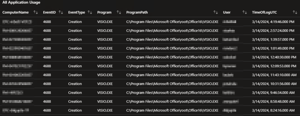
Chart: All Application Usage:
Continuing the same pattern, this is the same chart as the previous chart with the filtering for only the most recent event once again disabled.
While Visio has little obvious visible change to its pattern, we can now see how many people use Acrobat on a daily basis.
Adobe Acrobat
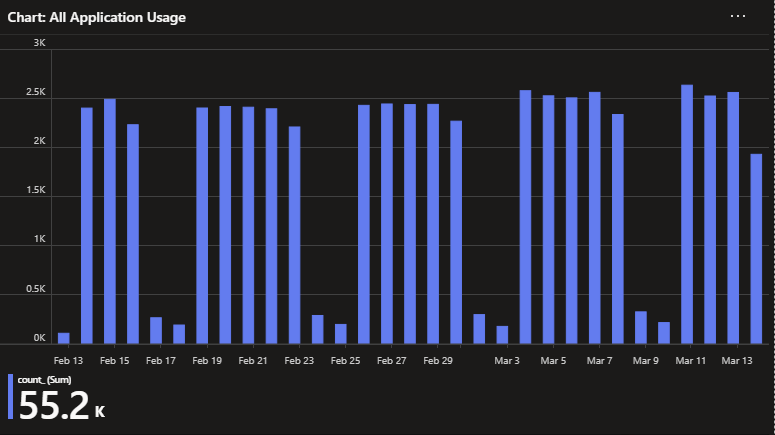
Visio
Device-Specific Results:
Sometimes you just want to zoom in on a specific machine and see what’s going on. This query does just that, it shows all application terminations and creations associated with the searched device(s). I say devices as it’s possible to return multiple devices given this search accepts complete or partial names.

Chart: Device-Specific Results by Top 10 Apps:
Circling way back to the dashboard and its goal of Outlier detection and investigation, this chart shows a breakdown of the top 10 programs associated with creation or termination events on the searched machine(s).

User ID Specific Results:
Much like the above device query, this query shows all application terminations and creations associated with the searched user(s) across any device.
This can be great for knowing what a set of credentials is being used for as again seen on the dashboard. While this can be used to investigate basic questions like “What apps is this employee launching?”, it can also be used for more in-depth digging like seeing where something like a privileged admin account is being used to executive applications across devices. Or, perhaps a service account that is reaching out to many devices. I do want to be clear though, for example, this won’t capture someone authenticating to your machine over the network, but it would capture them calling the execution of something over the network. Unfortunately, the exact execution type (local, CLI, Network, etc) isn’t something that these events capture so adding on data from something like the System Usage tool would be needed.
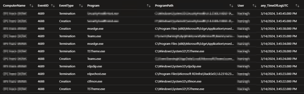
Chart: User ID Specific Results by Top 10 Apps:
Continuing with our same pattern, we have a chart showing the top 10 most executed applications by this set of credentials across any/all devices.
This again ties into the dashboard and is meant to help you investigate any anomalies it sees.

Ingestion information:
I’m going to make rather quick work of this section as this is a common page all of my collectors contain. In short, this page is for admins to monitor the deployment of this collector, future updates to it, and monitor the data being ingested.
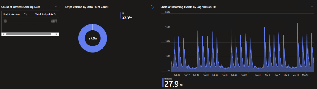
This is done with the help of three main charts. First, we have a simple list showing how many endpoints are checking in with what version of the collector script as of the most recent. Second, we have a breakdown of how many events are coming in with a given version of the collector. And third, we have a time chart showing the live feed of events coming in by what version of the collector.
If you were actively deploying an update, you would see the count of devices most recently checked in, the count of events, and the event chart all slowly shift over to that new version. Again, all of these elements are for fancy things like change validation to ensure your deployment is working and going well.
Additionally, the time chart helps you see that data is coming in at all. If that thing flatlines, you have a serious problem.
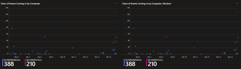
Second, this page has some direct ingestion monitoring. At the bottom are two charts with the same name, except one is “Distinct.” This is because the chart on the left shows a count of all events coming in per device, and the right chart shows the same thing except with a filter forcing it to only show distinct events (unique combinations of device name, user ID, path, program, etc). This lets us confirm the time tracking is working and not picking up duplicate events. This chart is used early on as another validation tool for your deployment to ensure no duplicates are coming in. However, the Distinct chart WILL break once you pass a certain data point or device threshold. I will say, it’s likely you will ingest some duplicates early on as part of the setup process but that should only be visible from the device you do the initial setup on.
Conclusion:
You should now have a good idea of what this collector can give you, and the value it provides. In the next part, we will be discussing the technical details and caveats of this system before then moving on to the cost.
The Next Steps:
See the index page for all new updates!
Log Analytics Index – Getting the Most Out of Azure (azuretothemax.net)
I will be putting the Application Usage guides on the Log Analytics Index page under the System Usage series.
Disclaimer:
The following is the disclaimer that applies to all scripts, functions, one-liners, setup examples, documentation, etc. This disclaimer supersedes any disclaimer included in any script, function, one-liner, article, post, etc.
You running this script/function or following the setup example(s) means you will not blame the author(s) if this breaks your stuff. This script/function/setup-example is provided AS IS without warranty of any kind. Author(s) disclaim all implied warranties including, without limitation, any implied warranties of merchantability or of fitness for a particular purpose. The entire risk arising out of the use or performance of the sample scripts and documentation remains with you. In no event shall author(s) be held liable for any damages whatsoever (including, without limitation, damages for loss of business profits, business interruption, loss of business information, or other pecuniary loss) arising out of the use of or inability to use the script or documentation. Neither this script/function/example/documentation, nor any part of it other than those parts that are explicitly copied from others, may be republished without author(s) express written permission. Author(s) retain the right to alter this disclaimer at any time.
It is entirely up to you and/or your business to understand and evaluate the full direct and indirect consequences of using one of these examples or following this documentation.
The latest version of this disclaimer can be found at: https://azuretothemax.net/disclaimer/
