Introduction:
For those of you familiar with my work on Log Analytics, you know that I have at several times throughout several articles touted the ability for PowerShell to pull Windows Events, including those from the Security log which the now old Log Analytics agent could not do. And, unfortunately, the new AMA has other faults which prevent me from saying that it satisfies that need.
That said, event collection is not something I have really shown off yet. Granted, the Event Collector in my Windows 365 monitoring does make use of this, I just didn’t make a point of highlighting it. With this article and series, that changes. This collector pulls a multitude of Windows events with a primary focus on showing an employee’s usage of a machine, with a secondary benefit being the ability to examine authentication attempts occurring on machines. This will give you insight into how employees are or are not utilizing their machines, as well as potentially identifying problematic authentication failures.
In this section, we will cover…
- Prior Knowledge Requirement
- Credit where Credit is Due
- The Nitty Gritty
- What does this tool provide? (Further breakdown in this section)
- Why is there no Uptime Chart?
- Conclusion
- The Next Steps
Prior Knowledge Requirement:
For those familiar already with my Windows 365 series or Endpoint Monitoring series, this is going to be exactly the same.
This series of guides builds on the information provided in my Log Analytics learning series V2. While that series used a generic and basic collection script for the sake of learning how this all works, this series will provide you with a fully-fledged collection script and workbook to go along with it.
Much of the concepts, ideas, terminology, and components carry over entirely from the learning series. For this reason, I will not be covering those items in depth as part of this series. Instead, I will expect readers to already have that knowledge, and/or I will link back to the learning series as needed. Linking back will be primarily for the shared setup components rather than pure knowledge sections. Expect those links to be mainly in the future articles in this series which cover actual setup.
While you don’t need in-depth knowledge of how this works under the hood to understand this initial article and the powerful data this tool provides, I would highly recommend entirely following the learning series before attempting to deploy this. That way you will have 80% of the required items set up already and, you will better understand what is actually happening and the costs behind what is being done, rather than just clicking the buttons I say to.
Credit where Credit is Due:
It’s worth adding that the original “Device Inventory” collector which was part of the Intune Enhanced Inventory by Jan Ketil Skanke of the MSEndpointMgr team is what gave me the guidance and inspiration for this collector way back when I originally started playing with the concept of collecting Windows events over a year ago. That said, honestly speaking, there is very little left of the original thing outside of the general concept of how arrays are built to upload information. This collector has been converted to the DCR-based Logs Ingestion API, utilizes the upgraded Function App for that API, is updated to the latest HTTP(s) Function App Auth I am a contributor to, and I developed the time tracking methodology and event searching/filtering methodology that made collecting Windows events possible.
The Nitty Gritty:
Before we get into the fun stuff I need to go on a brief tangent. In short, there are a lot of asterisks, footnotes, limitations, and caveats to understand with this solution. For instance, some of these limitations are due to choices by Microsoft regarding the actual logging of events, some due to a lack of documentation on Microsoft’s part, and others are due to the technology limitations we have for delivering this content. Primarily, while this is certainly a good tool to have, you need to understand that it does not replace or suffice on its own as a real-time security & authentication monitoring solution. That is why it is primarily about device usage, and secondarily about authentication monitoring.
The details that explain the what’s, let alone the why’s of that are quite technical and require a deeper understanding of how this works under the hood. Because of that, they really don’t belong in an overview article. As such, the second part of this series will cover those topics as well as talk about just how on earth this thing works.
What Data does this tool Collect?
Let’s get right into it. What does this achieve?
NOTE: All of the following screenshots and information are previews which are subject to change!
In short, Intune has a lot of reporting shortcomings, and this tool aims to fill in those gaps. This Log Analytics collector will pull a multitude of Windows events surrounding the usage of a machine in terms of the employee utilizing it, not performance metrics. The goal of this is to understand who & when someone is interacting with a machine, including authentication events both physically and over the network. These are the events collected.
- Security Event ID 4800 – Lock
- Security Event ID 4801 – Unlock
- Security Event ID 4624 – Logon
- Security Event ID 4625 – Logon Failure
- Security Event ID 4634 – Logoff
- Security Event ID 4779 – RDP Disconnect
- Security Event ID 4802 – Screensaver Invoked
- Security Event ID 4803 – Screensaver Dismissed
- System Event ID 1074 – Shutdown/Restart
- System Event ID 12 – Startup
We will then use Log Analytics workbooks to compile the data in a human-friendly manner for both viewing and exporting. If you want, you can take it to the next level and forward that data to other solutions (including 3rd party) via an Azure Event Hub.
Below is a summary of how the data is then primarily displayed. We will do a deeper look at each of these.
Dashboard:
- Logon Failures grouped by Type & 10 minutes
- Logon Failures grouped by Failure Reason & 10 minutes
- Top 10 Failed Logons by Remote IP
- Top 10 Failed Logons by Remote Machine
- Top 10 Failed Logons by Account
- Top 10 Failed Logons by Local Computer
- Top 10 Failure Reasons for Failed Logins
- Logon Successes grouped by Type & 10 minutes
- Top 10 Logon Successes Grouped by Account
- Top 10 Logon Successes Grouped by Computer
- Top 10 Logon Successes Grouped by Remote IP
- RDP disconnects grouped by 10 minutes
- RDP Disconnects Grouped by Machine & User
- Detailed RDP Disconnect Tracking
- I lied! – Controlling Top X.
Events Export:
- System Usage Exportable Log
Queries:
- Device Specific Query Results
- User Specific Query Results
- Last Logon: Machine
- Last Logon: User
- Reboot History: Machine
Extra Events:
- All Events for Selected Device(s)
- All Events for Selected User(s)
Ingestion Information:
- Count of Devices by Script Version
- Script Version by Data Point Count
- Chart of Incoming Events by Script Version: 1H
- All incoming Data Points by Point Type & 1H
- Chart of all Incoming Data by Device
- Chart of all Incoming Data by Device – Filtered
Dashboard:
This is what you will see right on the front page of the workbook. This page is primarily focused on authentication events and RDP Disconnects. While this is again a secondary focus, I have chosen to make it right on the main page such that anyone passing through will hopefully notice if something is amiss.
Like always, the time range for ALL data used in all queries of all pages is controlled by a time selector at the very top of the workbook.
Logon Failures grouped by Type & 10 minutes:

I admit my sample data here doesn’t make the most interesting graph. Hopefully, I will have more soon.
What this is showing is all Logon Failures grouped by every 10 minutes and broken up by the logon type such as Network, Interactive, Cached Interactive, etc. This is for trend monitoring and knowing when spikes occur, as well as understanding what kind of authentication was attempted.
Logon Failures grouped by Failure Reason & 10 minutes:

Again, sadly my sample data doesn’t look super exciting here. Hopefully, I will have more soon.
What this is showing is all Logon Failures grouped by every 10 minutes and broken up by the failure reason such as Unknown user name or bad password, account currently disabled, User logon from unauthorized workstation, etc. This is for trend monitoring and knowing when spikes occur, as well as understanding what kind of failures are happening.
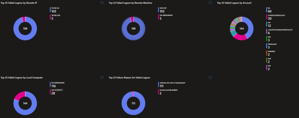
Top 10 Failed Logons by Remote IP:

This pie chart displays the top 10 Remote IPs responsible for authentication failures. This happens for network events like RDP logins, accessing C$, remote management, etc.
Top 10 Failed Logons by Remote Machine:
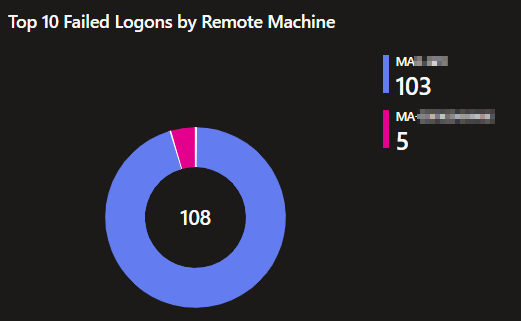
This pie chart displays the top 10 remote Machines responsible for authentication failures. Again, this happens for network events like RDP logins, accessing C$, remote management, etc.
Top 10 Failed Logons by Account:

This pie chart displays the top 10 account names showing in authentication failures. This helps identify what accounts are failing the most. If one account is being targeted, or having some sort of issue, this aims to reveal that.
Top 10 Failed Logons by Local Computer:

Similar to the remote machine chart, this pie chart displays the top 10 local Machines where authentication failures are occurring. This can still be from a network login attempting to access X local device.
Top 10 Failure Reasons for Failed Logins:

This is a breakdown of the top 10 failure reasons being seen on authentication attempts.
Logon Successes grouped by Type & 10 minutes:
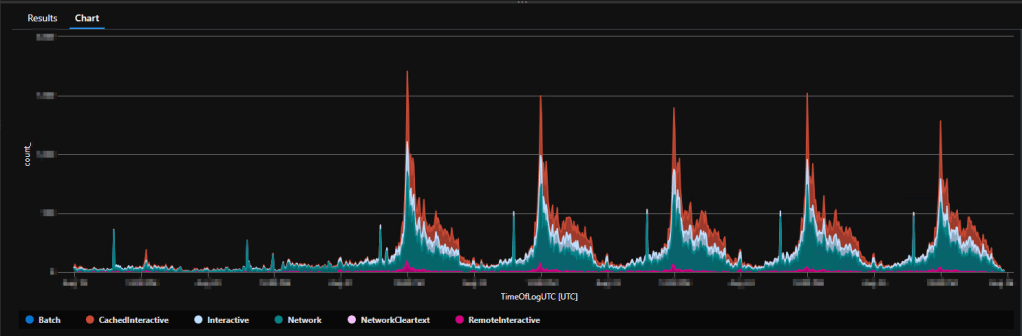
Just like logon failures, this shows all Logon successes grouped by 10 minutes and broken up by the logon type such as Network, Interactive, Cached Interactive, Remote Interactive, etc. This is for trend monitoring and knowing when spikes occur, as well as understanding what kind of authentication events are happening.
This is closer to how it will look in the workbook itself, I just don’t have a ton of sample data present yet here.

Top 10 Logon Successes Grouped by Account:
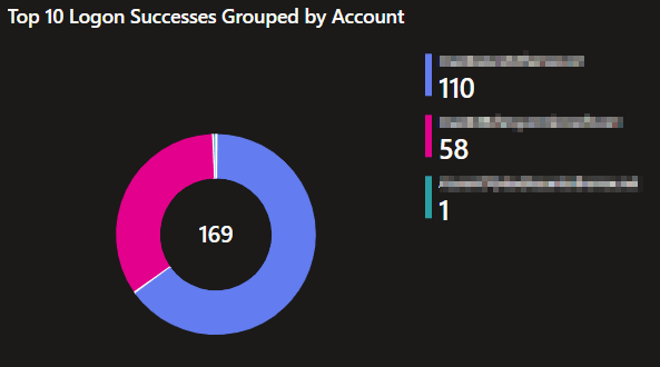
This pie chart displays the top 10 account names responsible for authentication successes. This helps identify what accounts are, for reasons not necessarily good or bad, authenticating the most.
Top 10 Logon Successes Grouped by Computer:
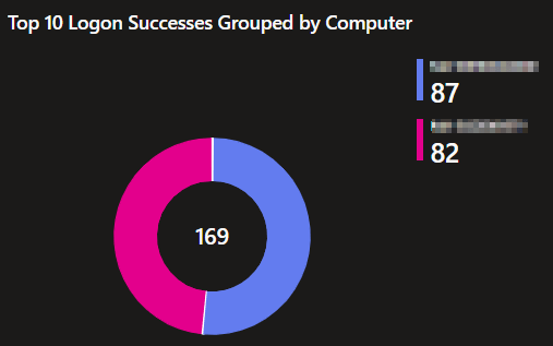
This pie chart displays the top 10 machines where the most successful authentication events are occurring. This helps identify what machines are, for reasons not necessarily good or bad, getting authenticated to the most.
Top 10 Logon Successes Grouped by Remote IP:

This pie chart displays the top 10 Remote IPs responsible for successful authentication attempts. This helps identify what Remote IPs are, for reasons not necessarily good or bad, successfully authenticating to machines the most.
Strangely, network-based successful logins don’t tend to indicate a source machine like logon failures do so we don’t have a pie chart to show that.
RDP disconnects grouped by 10 minutes:

This is a spiritual successor, or predecessor really, to the RDP Disconnect monitoring in my Windows 365 monitoring. It’s tracking RDP disconnects over time. This lets you monitor for spikes in RDP drops suggesting something has gone wrong at a larger/higher level.
This is how it will appear in the workbook but again, this sample doesn’t have enough data to look pretty yet.

RDP Disconnects Grouped by Machine & User:

Again, much like my Windows 365 monitoring, this list shows the devices that have had the highest amount of RDP drops. I also grouped it by the user though so, if a machine is used by more than one person but not everyone is getting dropped, it becomes more clear. This lets you quickly identify those likely having a poor experience.
Detailed RDP Disconnect Tracking:

Again, much like my Windows 365 monitoring, this list shows exact details of the RDP disconnects that are occurring including the time, Computer, User, and full event message. This provides a simpler way to obtain more granular details of the above item.
I lied! – Controlling Top X.
For all of the above pie charts I kept saying “top 10.” That’s not really true though… There is actually a selector at the top right next to the time range selector to control this value.
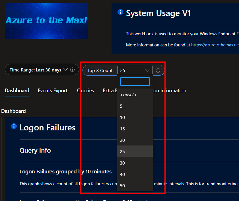
Thus with the click of a button, all the charts become top 5, 15, 25, etc. Both the titles of the charts and queries themselves will adjust to show the desired range. For instance, now it’s top 25.
That said, the pie charts are set to summarize any results higher than 25 into a single “other” category. thus, comparing to over 25 values is better for seeing how the top 25 compare to the next 25 in terms of volume than anything else.
Events Export:
System Usage Exportable Log:
By popular demand, our next page only has one query. Its goal is to provide a device and time-sorted list of every single piece of data for easy export. This is one of the few queries I have also made openable in Excel by default.

That said, I have a distaste for this query because it will likely be overwhelmed in medium to large environments. I believe there is a 10,001 line limit when exporting to Excel. Opening the query in Excel can be successful or just time out depending on the quantity of results. As such, this query has a warning box above it stating that…
This query is meant to provide an exportable list of every event from every device in the selected time range. This data will very likely exceed 250 lines in which case it needs to be exported using the triple dots in the upper right corner of the query or, the download arrow in the same location. Depending on the above factors, this may be an overwhelming amount of data. This could cause the query to fail. If so, consider the following options.
- Reduce the time range such that less data needs to be queried.
- Use the Queries tab to locate data for specific devices as needed.
- Consider writing a query to get only the data you are looking for in the export.
- Consider exporting this data via an Azure Event Hub to a system that can display larger chunks of data.
Queries:
As usual, there is a queries page where you can search for things more granularly. This includes both searches by specific devices or users.
Device Specific Query Results:

Much like the above section, this query aims to provide all information on all events received. The difference is that this one aims to provide that information for just the searched device(s). This includes the time of the log, computer name, event ID, event type, extended information (where remote IPs and names are kept, details in next article), logon type (if applicable), managed device ID, managed device name, the full event log message, the user, and time generated (time of log upload).
This is also where you can view all those other juicy events like lock, unlock, screensaver invoke, and screensaver dismissed which tell a story about how the employee is or is not using the device.
User Specific Query Results:
Much like the above query, this query aims to provide all information on all events received. Visually, it’s the exact same as the above so I won’t include a screenshot. The difference is that it’s looking for wherever X account is showing up, as opposed to looking at a specific machine. One interesting thing to do with this query is to see where admin accounts are showing up, and possibly authenticating over the network.
Again, this is also where you can view all those other juicy events like lock, unlock, screensaver invoke, and screensaver dismissed which tell a story about how the employee is or is not using a device.
Last Logon: Machine:
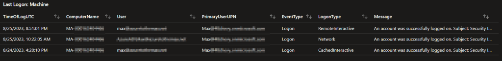
This query shows the most recent successful authentications to a machine by a given user and logon type. So, if you search up the X-important-persons machine, you can see all the accounts that have authenticated to that device in the selected time range by when they most recently authenticated. It will also further break it down to show multiple kinds of logon types if such events exist.
By joining this data to my Device Inventory workbooks, we can also see who the primary user of that device is to quickly answer the question “Does this authentication make sense.”
Last Logon: User:

Continuing on the same train of logic, and displaying the same data, this query instead looks to see anywhere a given user account has been authenticating, rather than looking solely at one device. Again, the results are limited to only the most recent authentication combination by the given user X on device X by logon type X.
Again, by joining this data to my Device Inventory workbooks, we can also see who the primary user of that device is to quickly answer the question “Does this authentication make sense.”
Reboot History: Machine:


And last but not least, at least for this section, we have the reboot history. This lets you see all the shutdowns, restarts, and startups occurring on the searched device. It also lets you see who initiated the restarts/shutdowns. This is typically the user or, the system due to things like updates. Startups are not tied to any user, the OS has no idea who pushed the button.
Extra Events:
All Events for Selected Device(s) & All Events for Selected User(s):
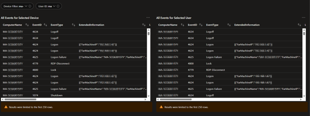
This page is largely unused now that a few issues have been worked out however, I think it makes sense to keep it around. The history here is that there used to be a minor issue with duplicate events and I used to do a lot more sorting on the queries page to hide certain things in addition to duplicates. Thus, there was a need for a page of queries that didn’t hide anything at all, just in case.
That said, the queries page still hides events from defaultuser0 (the account used during ESP). If needed, that data can be viewed here.
Ingestion Information:
This page is primarily used for monitoring the volume of incoming data and monitoring the deployment of updates.
Count of Devices by Script Version:
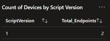
This cute little list shows the number of unique machines checking in and breaks that down further by what version of the collection script they checked in with most recently. So, if you are deployed to 10,000 devices using version 1, you should see 10,000 devices checking in with version 1. If you are doing an update and have version 2 deployed to half the audience, you would see 5,000 on 1 and 5,000 on 2.
Script Version by Data Point Count:

This is the same idea as the above except instead of breaking it down by computer and version, this counts the total amount of events received and breaks them down by the version they came in tagged with. So, as you deploy an update, this should slowly change over from one version to another as more and more of the events ingested in the selected time range are tagged with the new script version.
Chart of Incoming Events by Script Version: 1H:

Again, this is a further breakdown and visualization of the above two items. This is how many data points (events) have arrived grouped by one hour and distinguished by script version. This is primarily for monitoring the deployment of updates (new script versions). When a new version rolls out, a new color will show up corresponding to the new version and slowly eat away the area of the previous version.
All Incoming Data Points by Point Type & 1H:
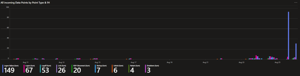

I always like to look at this one. This chart groups incoming events by 1-hour time frames and event type. In other words, you can see how many of each type of collected event is coming in graphed out over time. This can be useful for trend monitoring such as the huge spike of logion failures shown in the first graph.
Chart of all Incoming Data by Device & Chart of all Incoming Data by Device – Filtered:

I mentioned earlier how there used to be an issue with duplicate events. This section was for monitoring that. The left graph shows all events coming in by machine, while the right shows the same thing except with a filter to verify each displayed/counted event is unique. As you can see in this old capture, the totals are not matching between the two indicating it’s likely we are getting some duplicates.
To my knowledge, this issue is now entirely solved with the new tracking methodology used in the Windows 365 Monitoring and updated even further for this collector. That said, I still like to keep these two queries around just in case.
Why is there no Uptime Chart?

I am willing to bet someone will wonder why I don’t have any uptime tracking like the above from Device Monitoring. I have the shutdown / startup information, why not graph it? Well, the answer is pretty straightforward. In this collector, we ingest Windows events, and we try to ingest them as quickly as possible. Because of that, ideally, we will only have logs of the events for 30 days (assuming you are on the free storage tier). But, that means that if a machine had over a 30 day uptime and thus its last startup event was over 30-days ago, it would just fall off the chart as we would have no data for that event anymore.
Instead, that tracking lives in Device Inventory where we simply query device uptime each time the collector runs. It doesn’t matter if that uptime is 3 years, we will get a fresh data point that will hang around for 30 days each time the collector runs every four hours. Again, it’s not the age of the data that matters, it’s the age from ingestion time to Log Analytics.
Conclusion:
You should now have a good idea of what this collector can give you, and the value it provides. In the next part, we will be discussing the technical details and caveats of this system.
The Next Steps:
See the index page for all new updates!
Log Analytics Index – Getting the Most Out of Azure (azuretothemax.net)
I will be putting the System Usage guides on the Log Analytics Index page under the Windows Endpoint series.
Disclaimer:
The following is the disclaimer that applies to all scripts, functions, one-liners, setup examples, documentation, etc. This disclaimer supersedes any disclaimer included in any script, function, one-liner, article, post, etc.
You running this script/function or following the setup example(s) means you will not blame the author(s) if this breaks your stuff. This script/function/setup-example is provided AS IS without warranty of any kind. Author(s) disclaim all implied warranties including, without limitation, any implied warranties of merchantability or of fitness for a particular purpose. The entire risk arising out of the use or performance of the sample scripts and documentation remains with you. In no event shall author(s) be held liable for any damages whatsoever (including, without limitation, damages for loss of business profits, business interruption, loss of business information, or other pecuniary loss) arising out of the use of or inability to use the script or documentation. Neither this script/function/example/documentation, nor any part of it other than those parts that are explicitly copied from others, may be republished without author(s) express written permission. Author(s) retain the right to alter this disclaimer at any time.
It is entirely up to you and/or your business to understand and evaluate the full direct and indirect consequences of using one of these examples or following this documentation.
The latest version of this disclaimer can be found at: https://azuretothemax.net/disclaimer/
